Welcome to “Chart Chats”, the ultimate gathering of data’s finest emissaries! In this series, we’ll get to the heart of different chart styles to better understand how they tick, through intimate and humorous interviews with the charts themselves.
Today, we’re bringing you the bar, the pie, and the line. Strap in for a rollercoaster ride through the whimsical world of data visualization!
Let’s welcome the charts!
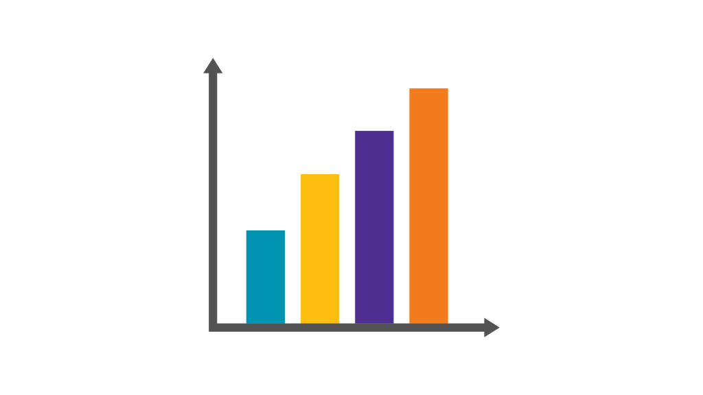
“Hey there, folks! I’m the Bar Chart, the heavyweight champion of categorical comparisons and the life of every data-driven party. When it’s time to stack ’em up and knock ’em down, you better believe I bring the bars! Remember, in the realm of data, I’m the one who raises it!“
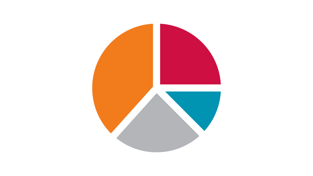
“Greetings! I am the illustrious Pie Chart, ruler of sectors and champion of proportions. With my sumptuous slices, I’ve conquered countless spreadsheets and dinner parties alike! Remember, friends, there’s nothing more satisfying than a well-balanced pie.”
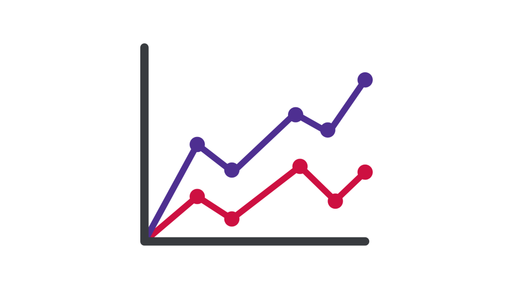
“Salutations, esteemed audience! I am the Line Chart, conductor of trends and guardian of gradients. Through peaks and valleys, I guide you on a voyage through the fluctuations of data. With my guidance, each data point tells a story, and every line is a lyrical masterpiece!”
Well it’s a delight to have you all here! So bar chart, let’s start with you. Tell us, what’s life like as the ruler of categorical comparisons?
“You know, I thrive on the energy of a good comparison. Whether it’s analysing sales figures or evaluating survey responses, I’m the life of the data-driven party. Remember, when it comes to raising the bar, I’m the one who brings the drinks!
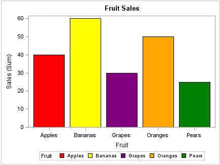
Let’s say you’re comparing the sales performance of different fruit categories. That’s where I shine! With each bar representing a category and its height showing the sales volume, I’ll help you spot the winners and losers at a glance. Cheers to clarity!
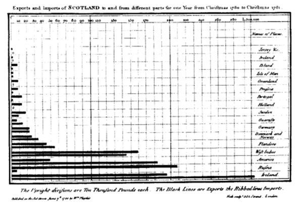
Now, most people will tell you that the first bar chart is the one that William Playfair created showing the imports and exports of Scotland by categories, in a timeline from Christmas 1780 to the following Christmas of 1781. But let me tell you something that most people don’t know.
There was a bar chart from almost 300 years earlier from a Frenchman named Nicole Oresme called “The Latitude of Forms”. This example uses bars to represent values of velocity over time of a moving object. The time has been plotted along the horizontal axis, while the velocity values are plotted on the vertical axis. I know it sounds like really complicated stuff, but the point is that the bar chart is actually the oldest chart – don’t forget that!”
Wow, that sounds really interesting! If you don’t mind me asking…
“Enough about me now! Let’s pass it over to my good friend Line 🙂 We hang out all the time! Oh… and of course you too pie…”
Oh really? So, where do you two know each other from?
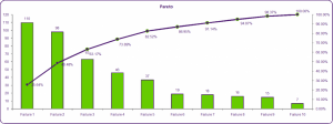
“Well, we actually work together sometimes, for example on a Pareto chart – where the bar values are shown in descending order, and the cumulative total of the values shown is represented by the line. This is most useful when there is an interest in showing the relationship between the individual value of a category to the overall total of those categories.”
I’m sure all of our audience have come across a pie chart at some point or other. How long have you been around for?
I was invented over 200 years ago so I’ve been around for a long time. And for all you haters out there, I was invented by William Playfair – the same guy who invented the bar, line and area charts – so there!
Final words before we leave you two to it?
No 3D charts, avoid that all costs. A 3D chart walked into the bar and the barman said, “You stick out like a sore thumb”. *snigger* And watch your colours, keep all the bars the same colour unless you have a reason not to. And not too much on the chart – if you have scale labels at each interval than gridlines across the chart are not necessary, neither would value labels on the bar. However, you could go in the other direction and remove the axis altogether if value labels are included. And…
OK, so in one sentence?
Watch the scale, keep it simple and basically just keep to the bar code!
Thank you very much.
…Before you go do you want to see my party trick – it’s really good…
I suppose so…
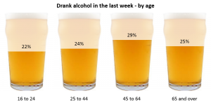
Well, you think bar charts are only squares and rectangles? Actually, I can contort into different shapes, pictures and icons… like this…
Or this…
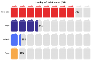
That’s amazing – I wonder if you could show me how you do that?
Actually, it used to be really hard to do. But you are in luck! There’s this brand new visualization tool called Vizualz which allows you – or anybody really – to get these amazing looking charts with hardly any effort at all! Check it out here.
We sure will!
